Wednesday, 5 December 2007

Ident Two - Reactor

I've been trying my best to get to grips with reactor. It's tricky stuff, but so far I have been able to get a few things out of it. My idea for the second ident is to use the cube in a different way other than it just turning into place. A crane will knock into the cube causing the parts to fly about in different directions.
-
I've had a play around in reactor with rigid body collections and have managed to come up with the following video. This is just a small test I have done to give the general idea as to what I would like to achieve.
-


I would like to have the ball attatched to the crane so i've been playing around with reactor rope also. This is quite ambitious but i'm hoping everything will join up and work together!
-
This is a test video I have created using reactor rope.


-

The Cube Faces (detail)

It may seem like an easy thing, applying a few images onto cube faces. But I found with most things, it isn't as easy it might appear to be.
-

I obtained a selection of images i believed suited the channel, and themes from my mood board desi
gn. The images ranges from underwater, moantains to construction plans etc.
-

The images had to be split up into 6 seperate images so each part could be applied to the surfaces of the cube. Easy peasy. I s
plit up the images into 6 sections using Photoshop, imported them into 3D max, applied them onto the cube face, hit render and VOILA! it's wrong! Take a look at the rendered picture.

-
The images
are all wonky and do not align properly. Just look at the pencil! I realised that i hadnt compensated for the black dividing grid lines on the cube. I had to put all my images back into Photoshop and I created a template with black lines already on. This was a long shot. I put the image on this and using layers, I copied each individual square and saved it as a new file.

<-- So I went from this...Put it onto this -->


Then copied each section the square and made lots of little these.. Some of the image was lost, but it's ok, honest :) You don't notice anyway.


The final result..

Cube Re-Design

Thought i would update my blog to show how i'm getting along with the idents. With it being so close to the end of the semester, my idents are really shaping up and should be ready to be handed in on time! Well they have to be i spose :-)
-

I'll start off with the Cube itself. This was actually done very early on in the project, i just didn't do a blog about it. Thought i better had as it's a big change in the design.
-
I had problems with my original cube using planes and chamfer boxes, and being able to rotate them like a proper rubiks cube. Although my cube was good as it was, I had to think of another way around it. I decided to remove the planes and place the images I was using directly onto the chamfer boxes surface vertex. This simplified the cube and removed the annoying planes I was using. I dont know why I didnt think of this before :-/


Applying the materials onto the cube sides took a lot of time as each one had to be rotated accordingly. Also I had to make use of the multi-material function, something I didn't know existed. The material viewer seems to be limited to only 24 materials, and I wasn't sure how I could add more. The multi layers got around this problem. I'll explain more on this in my write up.

Although there is not much difference in appearance, the new method of making the cube sorted out all my problems with rotating it.

<-- Original Cube - Re-Design Cube -->

Monday, 19 November 2007

Rotate Woes and Pivoting (Reflections Too!)

Spent most of the morning trying to solve my rotating the cube problem. Max didn't like me animating each grouped cube when I selected them all. Instead of animating the entire selection it would rotate each piece individually. You can see what I mean from the video..


Animating all parts of the cube (annoying!!!):

-

So if I grouped all of the cubes I wanted to move, this would solve the problem! Brilliant? er NO! Because certain parts of the cube are grouped, this restricted me to what parts I could actually rotate. So I had the idea of grouping certain parts, rotating them, then un-grouping them to allow me to group other sections. The idea was good but Max decided he didn't like it and decided to remove the animation I had done for the group I had just un-grouped!

-

Confusing?........................ yep!

-

So the next steps where to understand how things rotate and this lead me on to Pivot Points. Each individual square has its own Pivot Point, which is the source of it's own rotation. Look at the image and it shows the Pivot Points for each individual square.

-
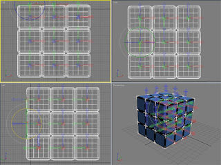
-

The next step was to move all the Pivot Points for the squares to the middle. Under Hierarchy you can select the pivots, so I clicked the effect pivot only tab, selected them all and moved them to the middle. Went back to animate the cube and it worked. Also a nice helpful feature is the Angle Snap Toggle which snaps all the cubes together so none will be out of alignment.

-

After this I am going to play around with reflecting the cube onto the surface, so here is a small preview of how it rotates properly, and a nice reflection underneath.

-

Rotate and Reflection:

Thursday, 15 November 2007

Re-Design Cube and Animation

Before I begin I got bored and looked up the Rubix cube, and realised i've been making the common mistake of calling it a Rubix cube, when it's actually a Rubiks cube!! (it was originally called the "Magic Cube", how very interesting-ish).

Anyway, i've spent all afternoon working with the cube (can u believe putting a bunch of squares together can be so time consuming?!). I moved away from the blocky simple squares done in my original play around and I found that using the
chamfer box gives a much nicer shape with nice rounded edges.

For each side of the cube I'm using planes, and I've removed all the unnecessary ones to make it true to a real 3x3 rubiks cube. i.e. I only have 54 faces on the cube.

CONSTRUCTING THE CUBE:

Also I have made a quick animation showing how the cube moves. Haven't figured out an effective way of moving all the rows and blocks yet. Max doesnt like it when I rotate and animate, hard to explain and slightly confused at this but hopefully I will figure it out :-/

ANIMATING THE CUBE:


Early Design Ideas

I've had a quick play around in 3D Max and have rendered a few images to show the sort of approach i'm making with the idents.

*NOTE* This are some very early work and will change, but thought i'd upload it to show the general idea.


Storyboarding

Sorry for delay in posting blogs.

These are some early storyboards I have sketched for an idea I've had for the idents. The theme is a rubix cube, which I came up with randomly (don't know how I got the idea, it just popped into my head). Luckily the word DISCOVERY fits along a complete side of the cube. Too bad CHANNEL doesn't.

The rubix cube fits nicely with the discovery channel. I will rotate my three idents on this idea and have a diffrerent approach for each one. Hoping I can turn each one into something thats good (oops sorry about all the bad puns! will I lose marks?)


STORYBOARDS:


*BLOG EDIT* Have added the other storyboard ideas I have had for my other idents. One is a crane bashing the cube into tiny pieces, and the other is a space scene with the blocks floating away with gravity.

IDENT TWO:

IDENT THREE:-

Tuesday, 16 October 2007

Mood Board - The Discovery Channel

After much debating, The Discovery Channel is my choice for the assignment. I decided on this because of the wide range of network channels they operate. This gives me a wide range of ideas and possibilities with the different subjects the channels offer. For example I can create three separate idents, but each one based on a different network channel i.e. History, Animals and Science.

The following is my mood board for the Discovery Channel.


Thursday, 11 October 2007

Research Board - Idents

arghh!!! this blog thing keeps changing my font sizes! :-(

Anyway... For this module we're focusing on
television idents.. I've selected various idents from a selection of channels, one of which I might use for my assignment.

NATIONAL GEOGRAPHIC
The National Geographic is a well known and popular magazine covering issues and covers subjects such as the environment, animals, history and people. It also has a television channel available through Sky and Cable, and I’m not too ashamed to say I love this channel (yes I’m boring!!)


The Ident: It's a very straight forward and basic ident when it comes down to it, but surprisingly effective with the yellow rectangle above the text.

Thoughts?: I have a feeling the rectangle is supposed to represent the magazine, because the magazine has a yellow border around it. Clever huh? Maybe I can try to do something inventive like this with my project.

THE HISTORY CHANNEL
The History Channel is dedicated to showing history documentaries. These documentaries vary from the beginning of time to the present day, and insights into the future, and cover topics such as Ancient History, Medieval History, World War 1 and 2, The Vietnam War and current events (i.e. the Iraq War etc.).


The Ident: Again this is another basic ident with the main emphasis being on the H for History. They use striking red and yellow/gold colours for the main image and it gives off a serious and adult stance which is what the History Channel is known for.

Thoughts?: Again, I love this channel and no I’m not an old fogey. Maybe if I choose this channel I can spice it up and make it more appealable to the younger generation?


THE DISCOVERY CHANNEL
This channel has everything and anything you can think off to do with the natural environment, human, animal, science etc. It has a network of different channels so there is something for nearly everyone.

  • TLC
  • Animal Planet
  • Travel Channel
  • Discovery Health
  • Discovery Science
The Ident: I like their collection of idents because they mostly stick to the same theme but change slightly to match what network it is. For example, the standard channel shows the earth, but animal planet has an elephant holding the earth.

Thoughts?: The world is the theme with the discovery channel, and I love the elephant playing ball with our planet. I think they could have done a better job with the science and travel idents tho. Something more clever like the elephant please!


Monday, 1 October 2007

My first 3D max lesson (cos i wasn't here last week woops!)

This is my first blog for 3D Modelling & Animation, and also the first blog i've ever done!

After sitting through the lesson I know I have a lot to think about with the assignment and also getting back into 3d max again (been very lazy over the holidays!!).


We started the lesson by making fruit in a fruit bowl and i made the perfect red chilli, however this was actually my attempt at an apple which went very very wrong. Therefore I need a lot more practice with max to try to get familiar with it again.

Good Chilli tho!!


My re-attempt at an apple went a lot more succseful (with help from Jo). I was playing around with the soft selection tool to get the random shape of the apple.


My first thoughts for the assignment and broadcasting channels will be something to do with the various documentary channels you get on Sky, maybe National Geographic, Discovery or the History Channel.

I'm off to make a banana! byee